

Gingham in the Home
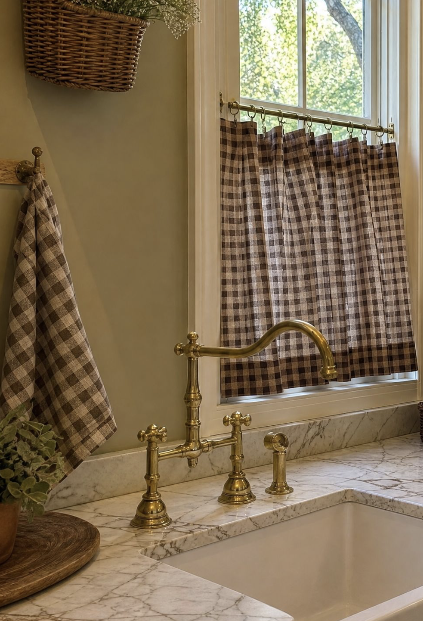
Gingham is one of those patterns that people either avoid entirely or deploy without much thought, and in both cases they're responding to the same problem: gingham has a strong associative pull toward a very specific aesthetic — red-and-white picnic tablecloths, country kitchens with a certain cheerful literalness, beach house everything. None of these are bad things in themselves, but they mean that gingham carries a context wherever it goes, and that context has to be managed intentionally if you want to use the pattern in a way that feels considered rather than borrowed from someone else's mood board.
The good news is that gingham, stripped of its most common color associations and scaled thoughtfully, is one of the most versatile and genuinely beautiful patterns available to a home. It has geometric precision — it's a woven check, structurally crisp — combined with a softness that comes from the way the two colors interact at their crossing points to create a third, blended tone. That optical complexity is what makes it more interesting than a simple stripe, and what allows it to work in rooms that have nothing to do with picnics or coastal living.
Color is the first and most important decision. Red-and-white gingham reads as country diner. Blue-and-white reads as coastal. Green-and-white is the most forgiving and the most naturally suited to interiors that draw on botanical and garden references — it feels grown rather than manufactured. Black-and-white gingham is graphic and contemporary, at home in a kitchen with dark countertops or a study with lacquered walls. Dusty, muted tones — a faded sage, an aged terracotta, a smoky lavender — read as sophisticated and work in rooms where brighter gingham would tip into cheerfulness you weren't after. The rule is simple: the more saturated the color, the more casual the result. Muted gingham is grown-up gingham.
Scale matters enormously. Large-scale gingham — checks of an inch or more — makes a strong, almost graphic statement and works best as a single dominant element in a room: a set of curtains, a large upholstered piece, a tablecloth. Small-scale gingham — the tiny checks sometimes called micro-gingham — is delicate enough to read almost as a texture from a distance and can be layered with other patterns more easily. It works beautifully as a secondary element: napkins against a solid tablecloth, a cushion in a room with a larger floral, a small chair in a room that otherwise plays it straight.
The rooms where gingham works most naturally are those where it can be used at a human scale — kitchens, dining rooms, bedrooms, and garden rooms — rather than in large formal spaces where the pattern's inherent domesticity can feel incongruous. In a kitchen, gingham appears as a roman blind in a muted sage or soft terracotta, or as seat cushions on painted wooden chairs. In a bedroom, a gingham bed canopy or a set of Euro shams in a dusty blue against white bedding has a quiet, considered quality. In a dining room, gingham napkins in a color pulled from the room's palette require nothing more to be exactly right.
What makes gingham feel sophisticated rather than kitschy is usually what surrounds it rather than the gingham itself. A dusty green micro-gingham cushion on a worn leather sofa, next to a stack of old books and a simple ceramic lamp, reads as collected and personal. The same cushion on a white slipcovered sofa surrounded by other country-cottage references tips into theme. Gingham needs contrast — something harder, something more unexpected, something that tells the eye this isn't an accident. Give it that context and it will reward you.
