

Floral Print in the Home
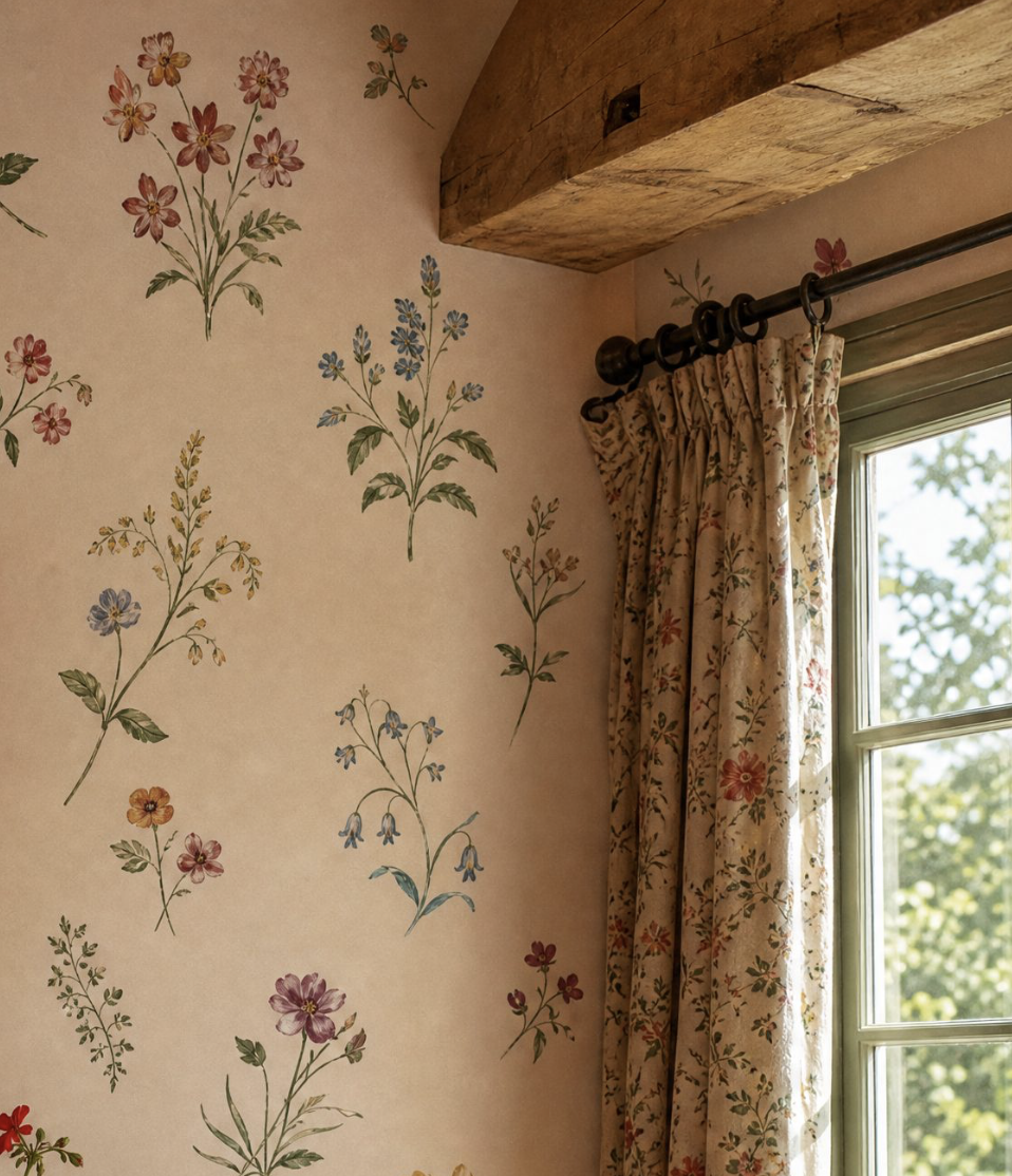
The word "floral" in interior design carries a significant amount of baggage, most of it pastel-colored and involving a certain kind of country cottage that peaked aesthetically in the early 1990s. The result is that a great many people who are genuinely drawn to botanical and floral references in their homes either overdo it in a way that tips into chintz, or avoid it entirely in favor of a cleaner aesthetic that, if they're being honest, feels slightly less like themselves.
There is a version of floral that has nothing to do with Laura Ashley and everything to do with the kind of intelligence and intention that makes a room feel genuinely beautiful. Understanding the difference is mostly a matter of understanding a handful of principles about scale, color, context, and restraint — and being willing to apply them with a clear eye.
The first and most important principle: floral prints work best when they read as observation rather than decoration. The botanicals in an herbarium illustration — precise, slightly faded, oriented toward accurate representation rather than prettiness — are floral but not cutesy. The overblown cabbage roses of a Victorian chintz are floral in a completely different register. The distinction is not about whether the flower is depicted realistically but about whether the print seems to be looking at the natural world carefully or simply using flowers as a cheerful motif. Prints that feel rooted in actual plant life — imperfect, detailed, a little wild at the edges — have a different quality than prints designed to be pleasing and inoffensive.
Scale and placement are where most people make the decisive mistake. A small floral print used everywhere — curtains, cushions, upholstery, wallpaper — produces the smothering effect that gave floral a bad reputation. The same print used in one deliberate place, with everything around it playing a supporting rather than competing role, produces something entirely different. The most powerful use of a large, bold floral is usually as a single statement: one wallpapered wall in a bedroom, a pair of curtains in a room that is otherwise spare, an upholstered headboard against white walls and linen bedding. Let the print be the room's center of gravity rather than its wallpaper in every sense.
Color temperature is the variable that most determines whether a floral reads as sophisticated or sweet. Soft, warm pastels — blush, lavender, butter yellow — produce the sweetness that many people are trying to avoid. The same floral recolored in deeper, more complex tones — burgundy and forest green on an ivory ground, deep indigo and botanical green on linen, terracotta and rust with dusty sage — reads entirely differently. The ground color matters as much as the print: a white ground is the most literal and the most casual; an ecru or natural linen ground is warmer and more complex; a dark or colored ground — deep green, charcoal, navy — is the most dramatic and the furthest from anything cutesy.
The rooms where floral works most effortlessly are those where some connection to the natural world is already present or implied: a bedroom that feels like a garden room, a dining room that looks onto a garden, a library where the botanical references on the walls connect to the plants on the shelves. Floral in a very modern, minimal space can work brilliantly as contrast — but it requires more confidence in the execution. The safer entry point is a room that is already warm and layered and simply needs the botanical note that a good floral print provides.
For the actual application: one good botanical print in the right scale, in the right color family, used in one place with complete conviction, will do more for a room than any number of smaller, hedged floral gestures. Commit to it. Let it be what the room is about.
